
Kinetic Combat App
A martial arts class management app that simplifies booking, scheduling, and tracking training sessions, helping fighters stay organized and committed to their practice.

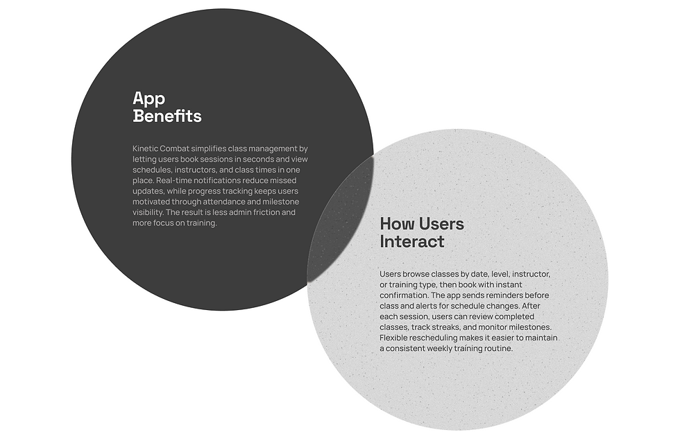
Kinetic Combat is a research-led UX/UI redesign of a martial arts class management app. The work started from evidence, market and behavior analysis showed a growing industry ($9.05B market, 18M annual participants) but persistent operational friction, with many schools still relying on fragmented tools and spending 25+ hours per week on admin. Through user segmentation, persona definition, and journey mapping, I identified three core gaps: high-friction booking, poor schedule-change communication, and weak progress visibility.
Keyword
Tool
Product
Project Type
Human-First Interface
From Chaos to Clarity
Reducing Cognitive Load
Figma, Miro, Adobe
Mobile App Redesign, UX/UI Design
Personal Project
Experimental

What's the problem?
Project Research
HOW DO YOU MANAGE A MARTIAL ARTS SCHOOL WHEN YOUR TOOLS ARE BUILT FOR EVERYTHING EXCEPT MARTIAL ARTS?
Most martial arts schools still rely on spreadsheets, paper forms, and generic fitness apps to manage their operations. The result: lost bookings, missed payments, and instructors buried in admin instead of training.
Data Research | |
$ 9.05B | The U.S. martial arts studio industry market size is growing at 7.9% CAGR |
18M | Americans participate in martial arts annually |
50,490 | Martial arts businesses in the U.S., up from 39,310 in 2020 |
25+ hrs | Weekly admin time for school owners managing without dedicated software |
THE MARTIAL ARTS SOFTWARE MARKET WAS VALUED AT $210M IN 2024 AND IS PROJECTED TO REACH $450M BY 2033, GROWING AT 9.5% CAGR.
The demand for purpose-built management tools is accelerating as schools shift from generic solutions to platforms designed specifically for martial arts workflows.
User Segment | |
60% | Male practitioners (but female participation is growing rapidly, especially in kickboxing and BJJ) |
40% | Female practitioners, the fastest-growing segment in combat sports |
3.9M | Active martial arts participants in the U.S. annually |
18 - 34 | Primary age group driving growth in martial arts participation |
HABIT | SITUATION |
Train 2-4 times per week on a set schedule | Juggling work, school, or family alongside training |
Prefer booking classes in advance through mobile | Frustrated by outdated booking systems or phone-only reservations |
Track personal progress and belt milestones | Losing motivation without visible progress indicators |
Want quick access to class info and schedule changes | Missing classes due to last-minute changes they were not notified about |
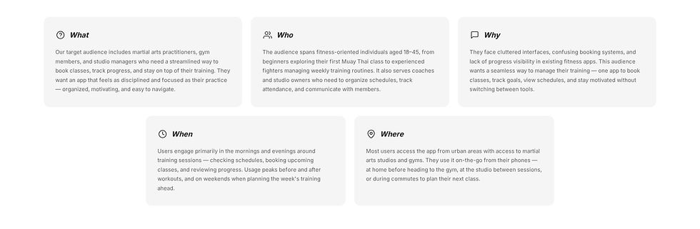
Who Truly Uses the App?
User Study
Kinetic Combat is designed for active martial arts practitioners who train multiple times per week and need a fast, reliable way to manage classes. Most users balance training with work, school, or family, so the experience must reduce decision fatigue and support consistency through clear scheduling, timely reminders, and visible progress tracking.
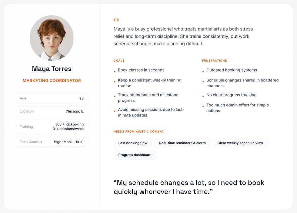
Primary User Persona
User Journey Map
Booking Experience


Key Design Decisions
• Prioritized booking flow with fewer steps and clearer confirmations.
• Structured schedule view by time, class type, and instructor.
• Notification hierarchy for reminders, changes, and urgent updates.
• Progress dashboard to reinforce routine and training momentum.

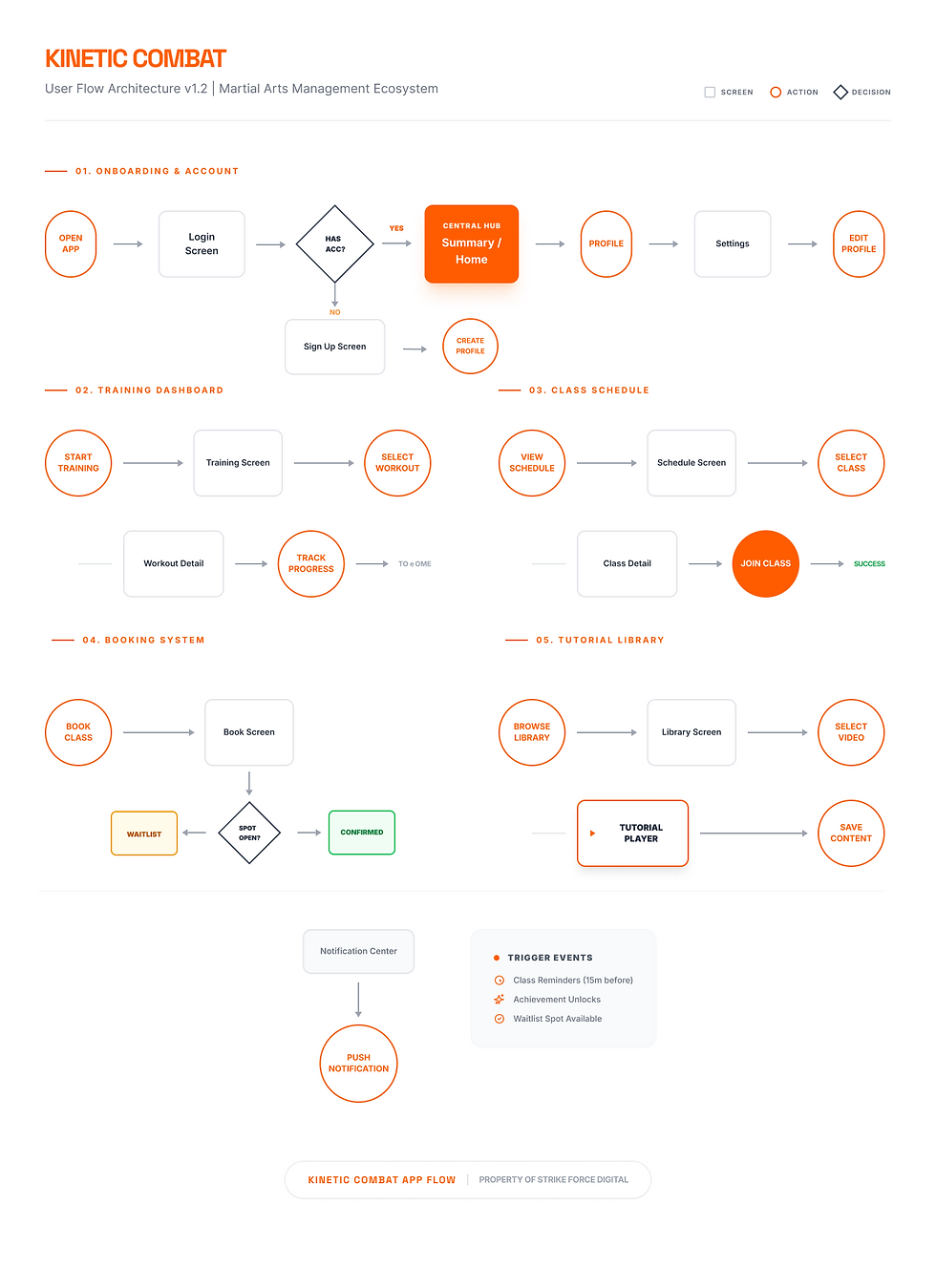
User Flow Architecture
The flow architecture was redesigned around the highest-frequency user task:
Open app → Check schedule → Compare class options → Book → Confirm → Receive reminder → Attend → Track progress.
To reduce decision fatigue, secondary features (profile, settings, content browsing) were separated from the primary booking path. This task-first structure improves scan ability, shortens decision time, and makes each screen action clearer and more predictable.
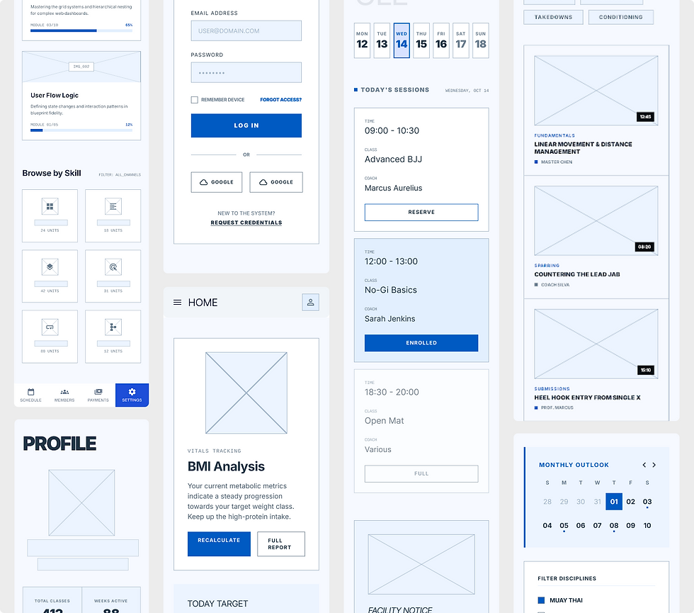
Low-Fidelity Wireframes
In this phase, I focused on information architecture, interaction flow, and content hierarchy before applying visual styling. I explored multiple layout directions for core tasks like booking, schedule review, training discovery, and profile management.
These wireframes helped validate navigation logic, reduce cognitive load, and define reusable UI patterns that later shaped the high-fidelity interface.
High-Fidelity UI Screens
Process Overview
-Getting Started
You can easily create an account

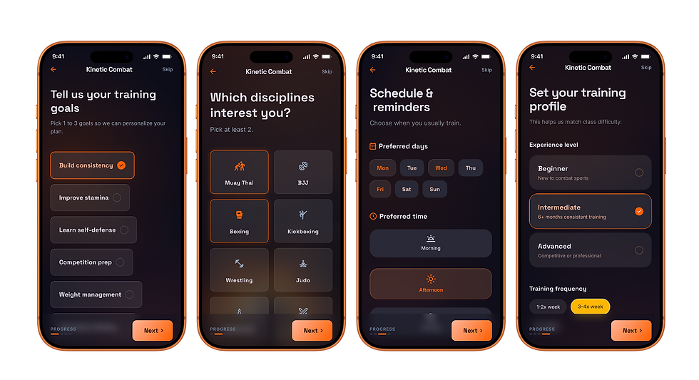
-Onboarding
This onboarding sequence captures user goals, preferred disciplines, schedule habits, and training level before entering the app. It personalizes class recommendations, reminder logic, and difficulty matching from the first session, reducing setup friction and improving relevance early in the user journey.
-Home page

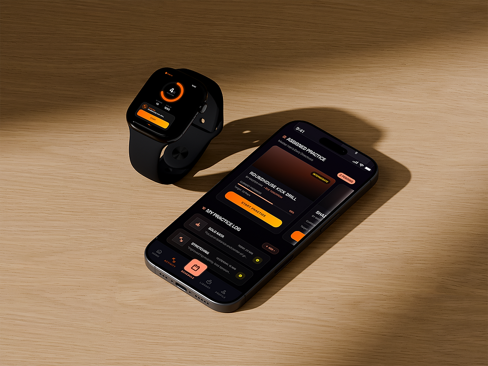
Home Dashboard
The home screen is designed as a quick decision hub, giving users instant access to key training actions, upcoming classes, and health progress in one view. It reduces cognitive load by prioritizing what matters most at the moment: train now, stay on schedule, and track consistency.
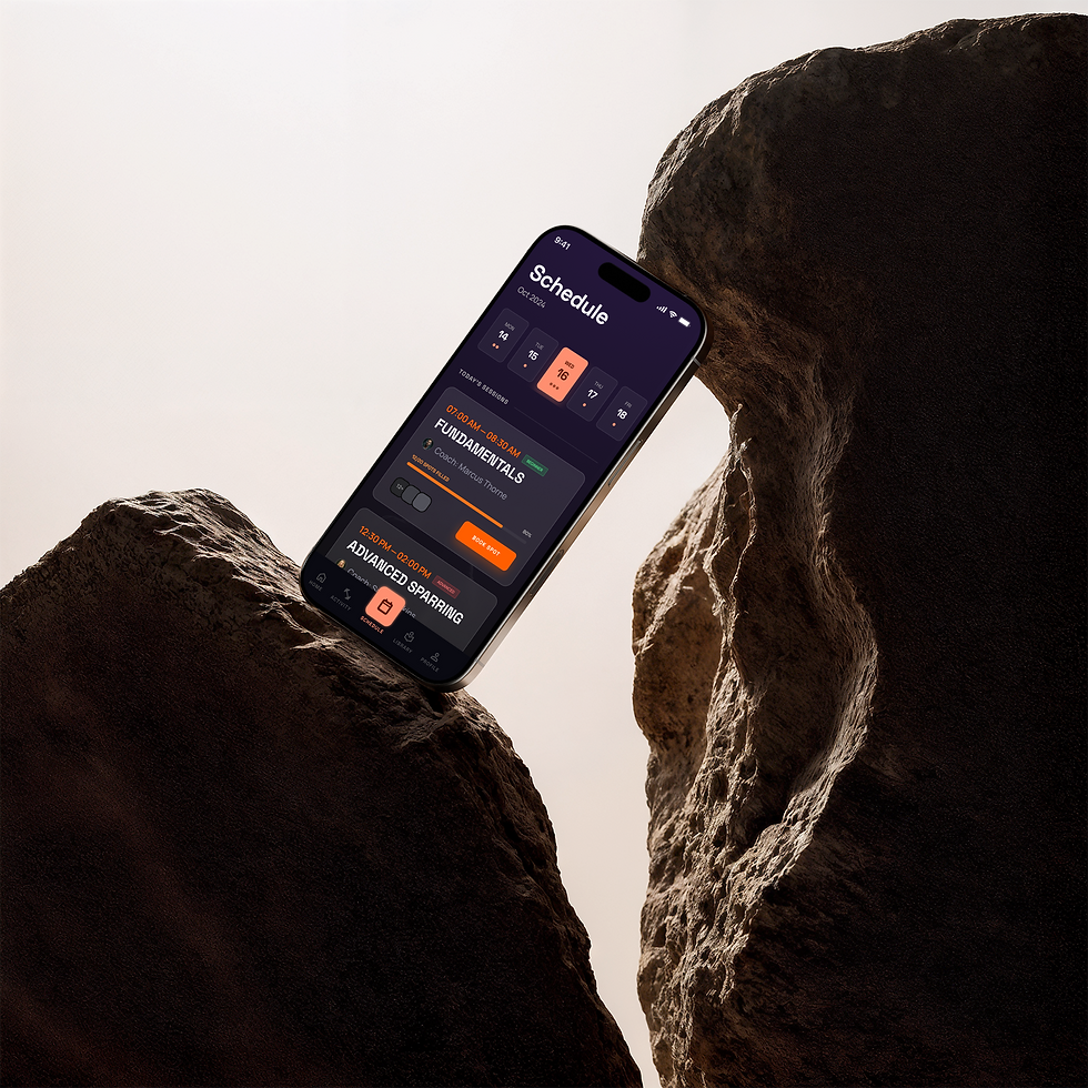
Schedule Page
It combines calendar visibility, timeline context, and class detail actions in one flow, so users can quickly scan availability, compare options, and confirm bookings without jumping across multiple screens. Priority states such as booked, waitlist, and full capacity are intentionally clear, while reminder controls and calendar actions support consistency after booking. The overall structure reduces decision fatigue and helps users stay committed to their training routine.

Usability Testing & Attention Analysis
To validate usability and visual hierarchy, I tested the high-fidelity prototype on key flows (home, schedule, training, and profile). I combined task-based testing with attention heatmap analysis to identify where users focused first, where they hesitated, and which actions were missed. These findings guided final refinements to CTA prominence, content hierarchy, and navigation clarity.

Usability Score | |
91% | Task Success Rate |
39s | Average Time to Book a Class |
87% | First-Attempt Completion |
6% | Error / Mis-tap Rate |
84/100 | SUS Score |
4.4/5 | Post-task Confidence |
Heatmap insights
Pilot test, n=8, 4 core tasks, moderated prototype sessions.
Primary attention clustered on KPI cards and high-contrast CTAs, confirming strong first-scan hierarchy.
Secondary actions in schedule and filtering received lower visibility, indicating discoverability friction.
Profile and progress areas showed strong engagement when tied to immediate goals and milestones.
Outcome
This redesign transforms fragmented class management into one cohesive mobile workflow.
By simplifying booking, clarifying schedules, and improving progress visibility, Kinetic Combat reduces admin friction and helps users stay committed to training.
Validation & Next Iteration
This concept was evaluated through scenario-based walkthroughs and heuristic review focused on booking speed, clarity, and confidence.
What improved | Next iteration |
• Clearer class comparison and booking decisions • Stronger confirmation and reminder hierarchy • Better visibility of progress to reinforce routine | • Run task-based usability tests on booking and rescheduling • Measure time-to-book, completion rate, and drop-off points • Test reminder timing and progress modules for retention impact |